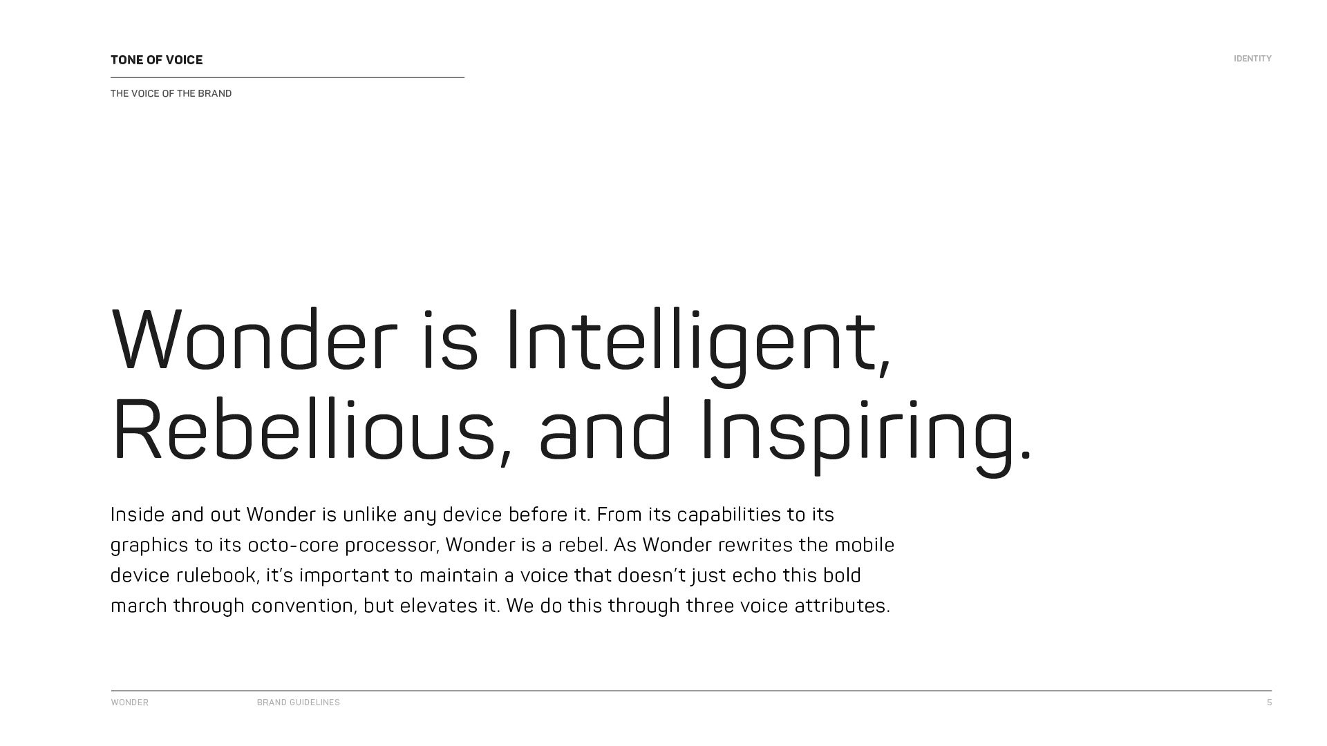
Wonder Visual Identity

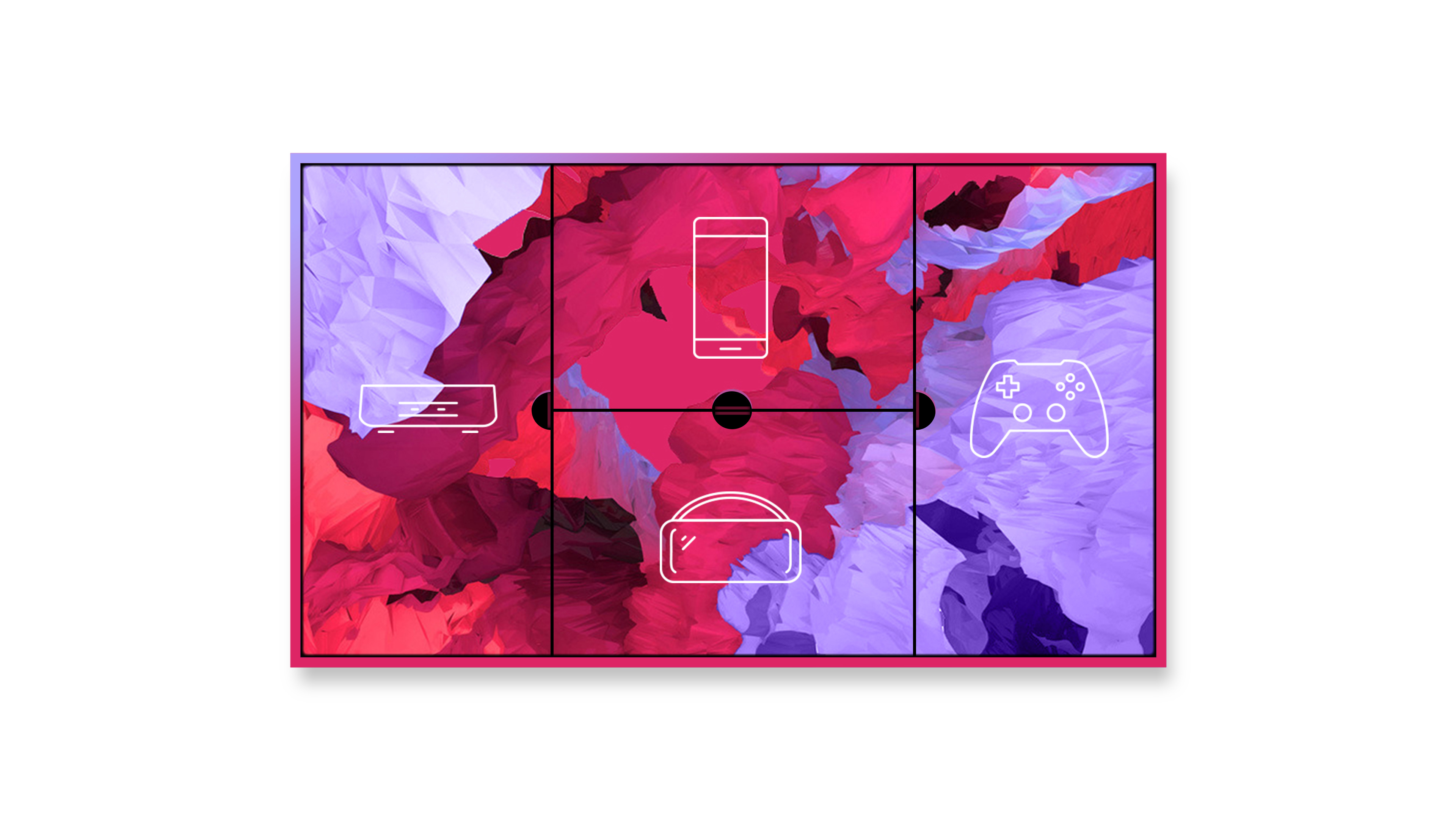
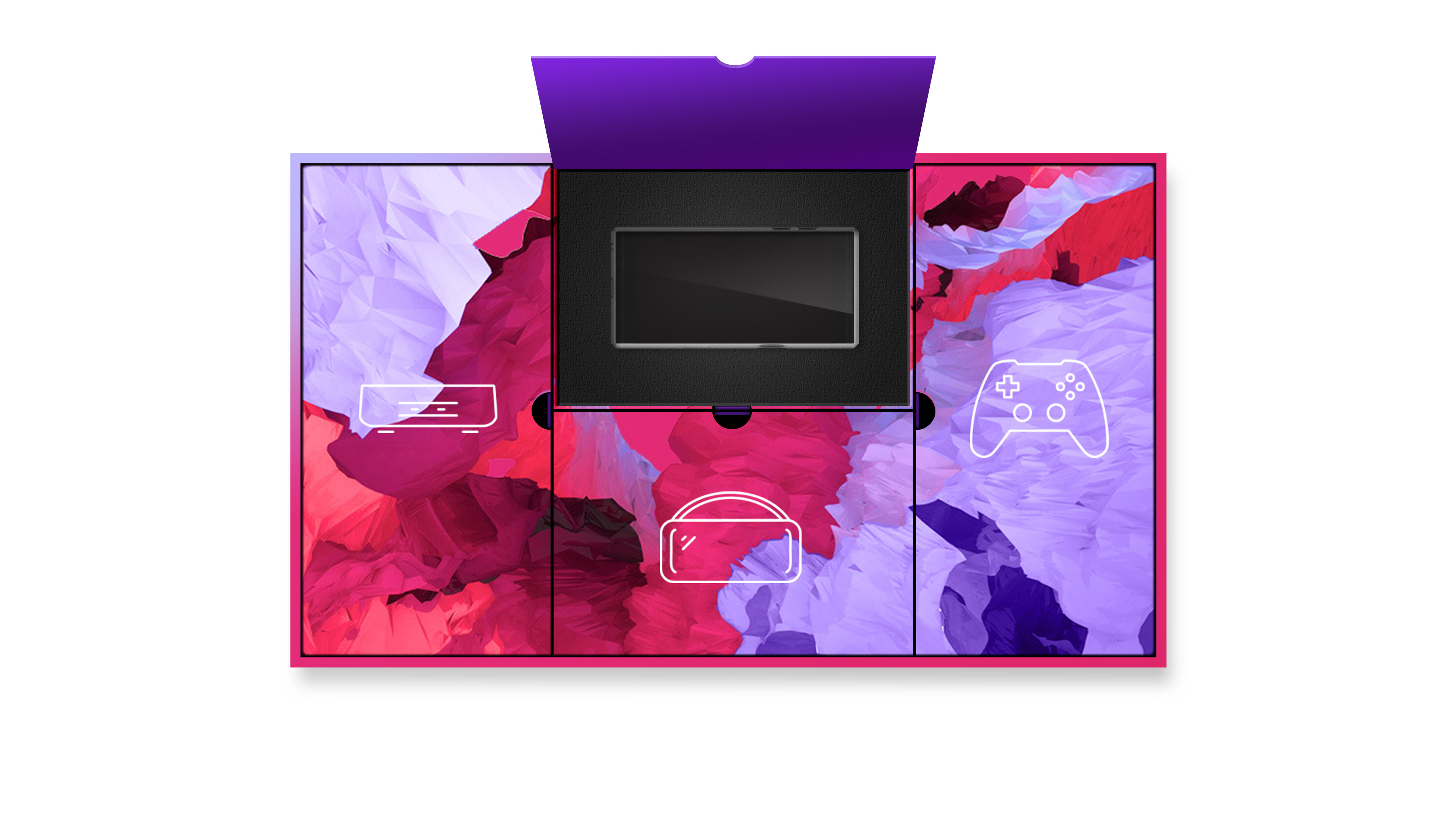
We developed Wonder's visual identity with only their name and logo as the initial seed. We based their visuals on the concept of inward, infinite possibilities while capturing their intelligence, rebellious spirit, and the inspiring posibilities their tech platform can unlock. Wonder is a tech startup that is building a unified ecosystem centered around entertainment, movies, games, and community. It's a phone, a game console, a VR system, a gateway toward the infinite.
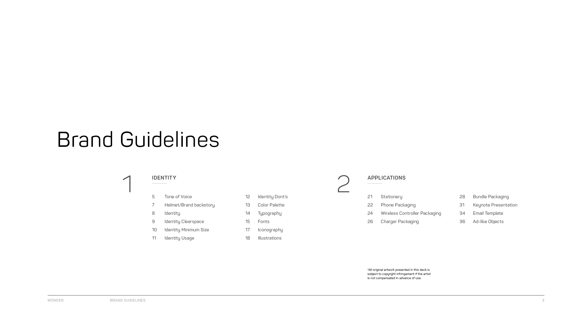
Brand Guidelines


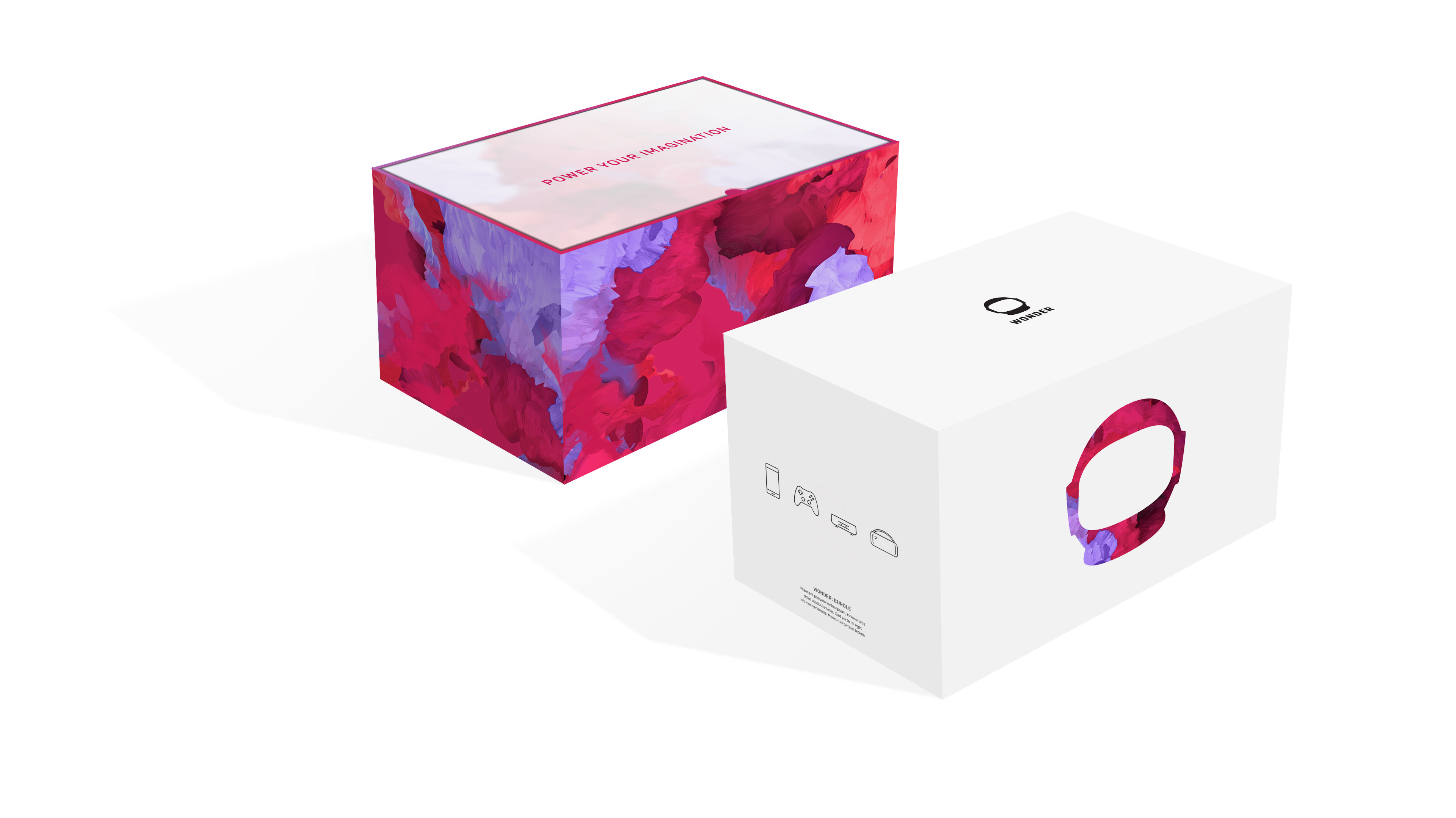
Packaging
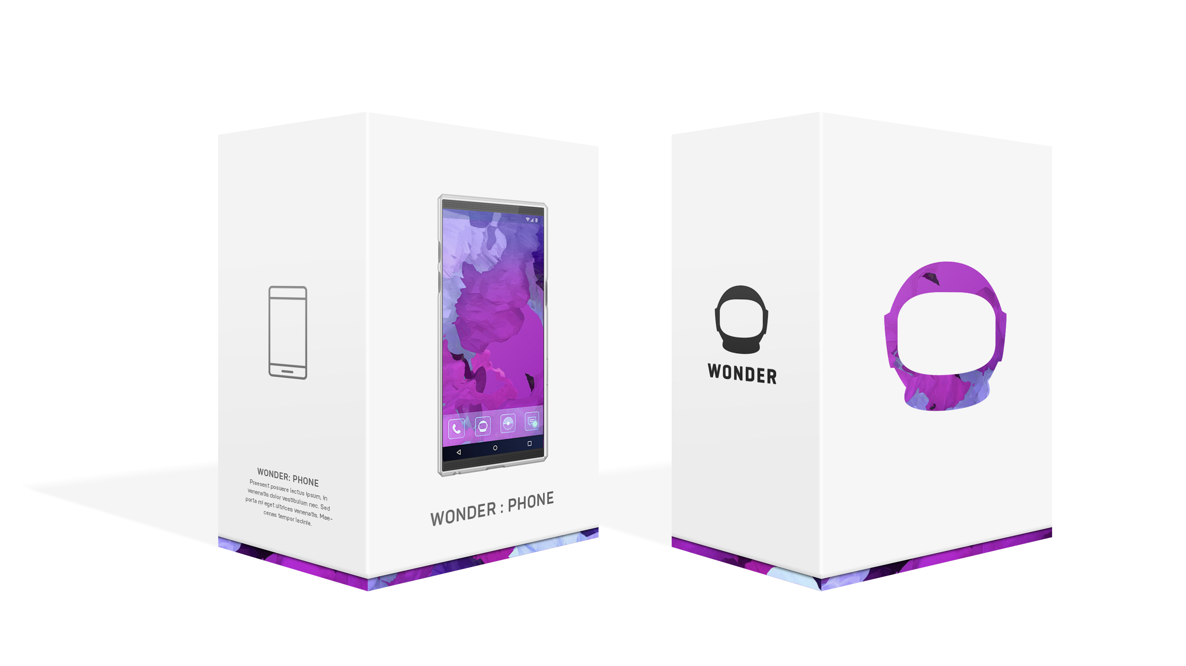
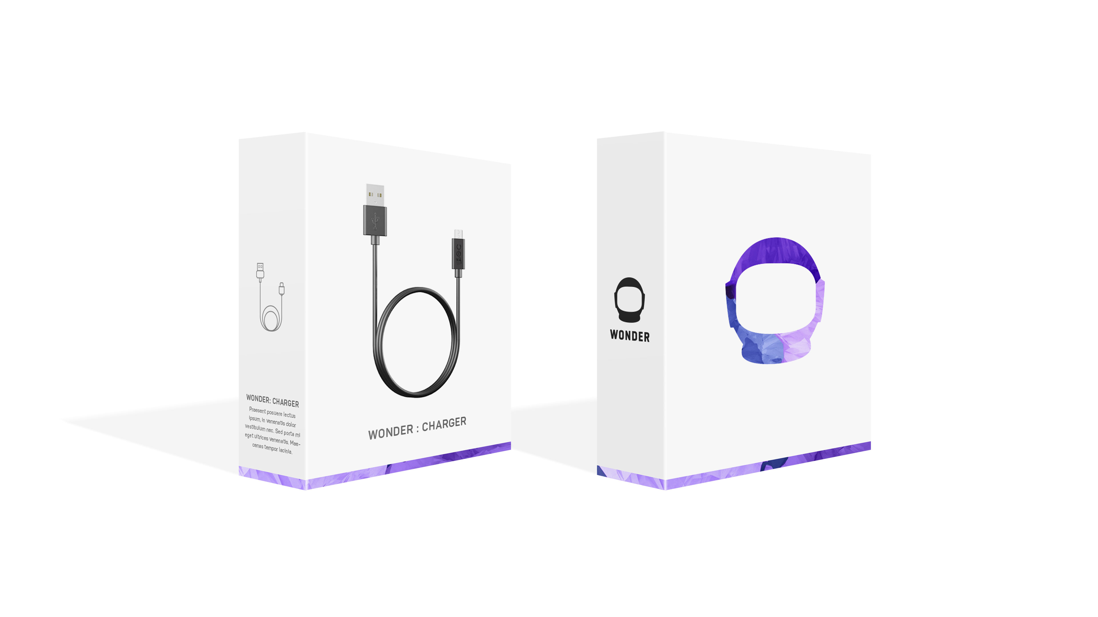
Like all good packaging, the Wonder packaging concepts attract as well as intrigue at retail. On closer look, they tell the brand story while retaining the minimalism, sophistication and richness established in the design language.
Bundle Concept

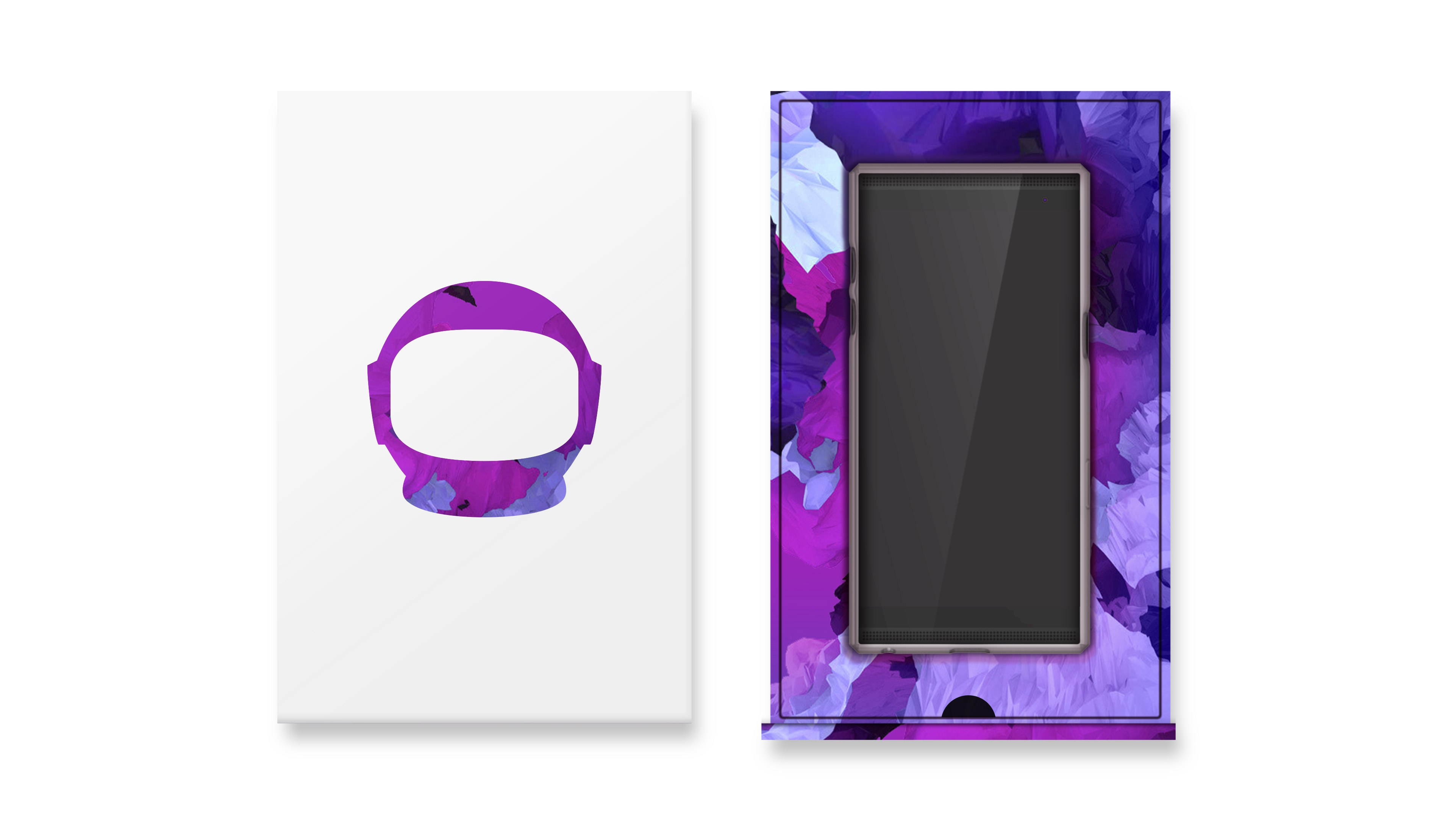
Phone Packaging Concept
Controller Packaging Concept


Cable and Accessory Packaging Concept

Team
AGENCY PHENOMENON
DESIGN DIRECTOR SIMRIT BRAR
ASSOCIATE CREATIVE DIRECTOR ALI FILSOOF
DESIGNERS MATTHEW PERDUE, STERLING FOXCROFT
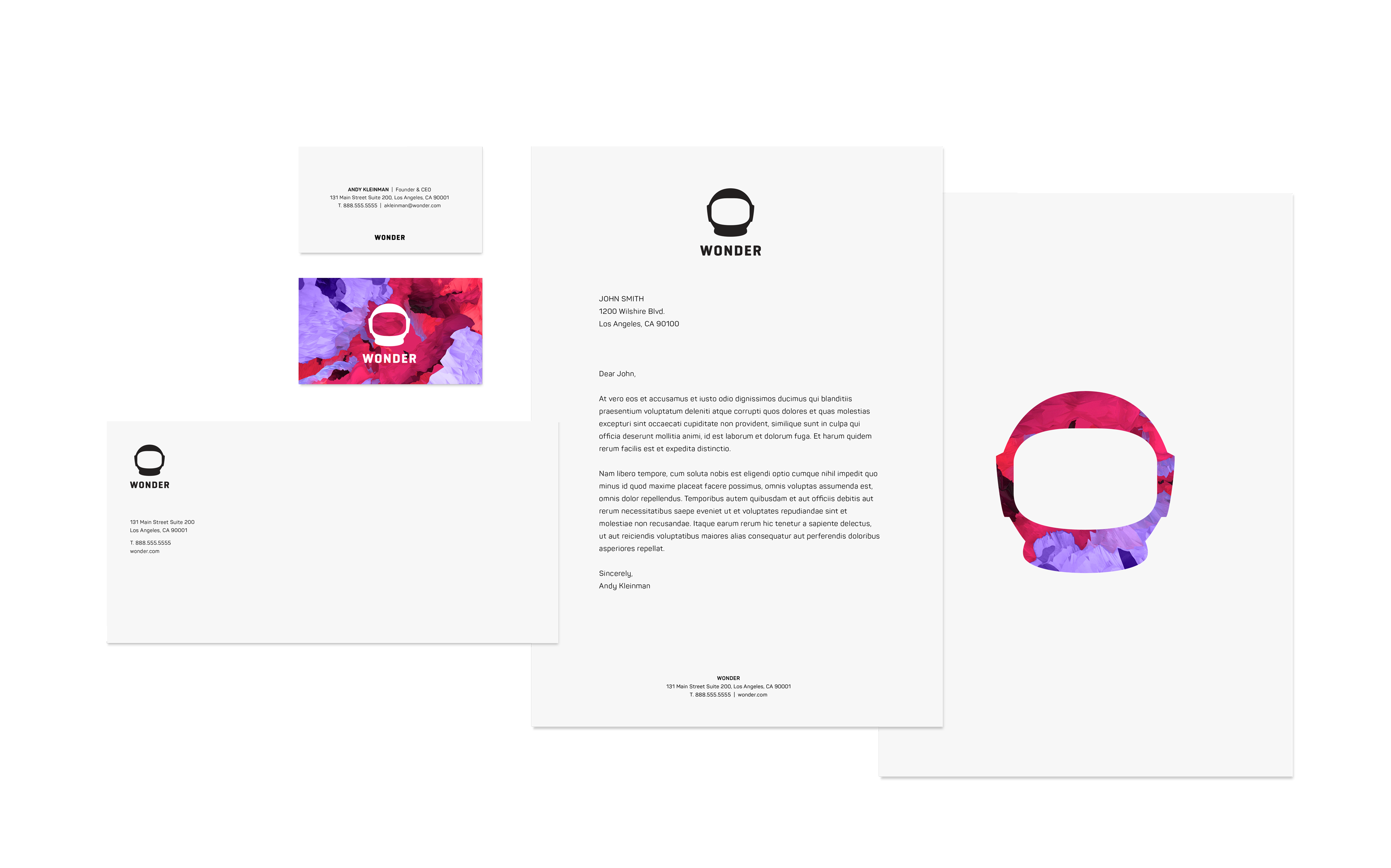
Stationery
All elements in the Wonder stationery have a clean symmetry to them. To add texture, one of the patterns is used on the back of the business card and the letterhead. In both surfaces, the texture is not used in large volumes, only small touches, so as to not distract from the information.
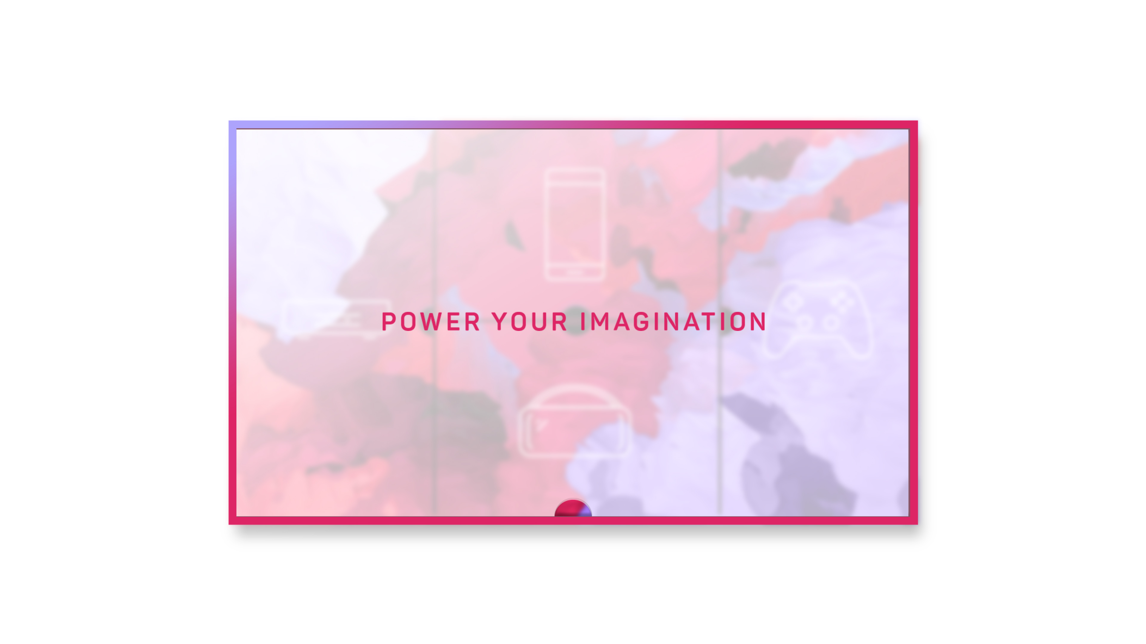
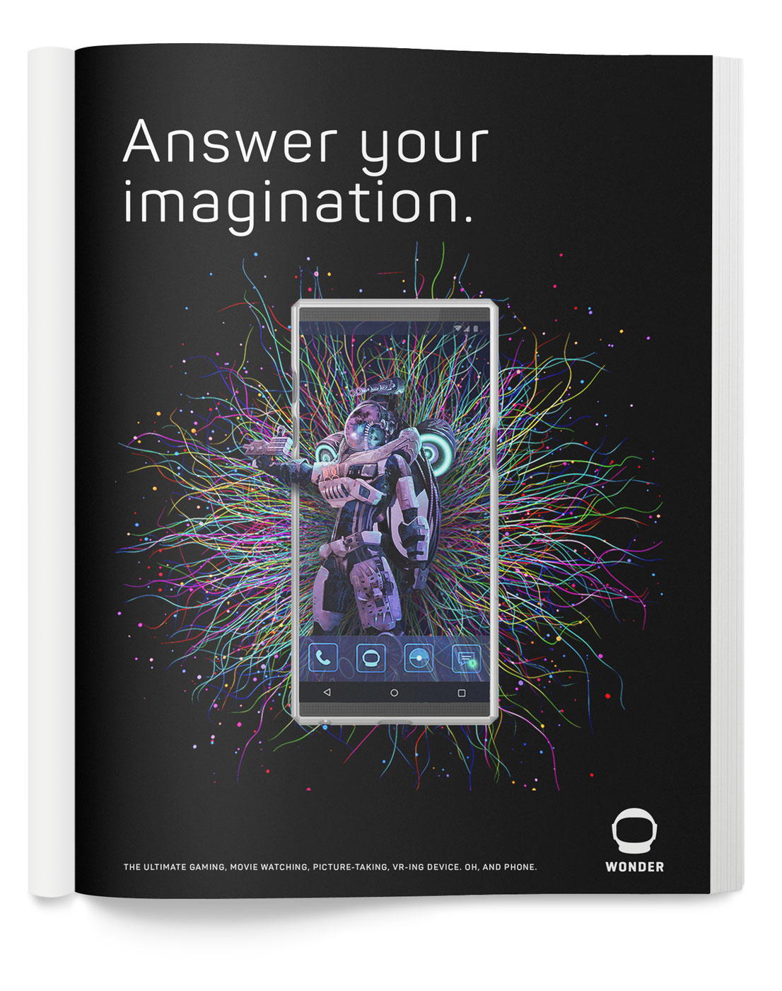
Ad-like Objects
The following are examples of ad-like objects in a 1-page or poster format. The artwork used in these carry the same scientific mystique, both artistic and technological in nature. The artwork is woven in and out of the products to convey the idea of infinite possibility that comes from this ecosystem.


Matthew Perdue
Designer & Art Director
©2024 Matthew Perdue, Inc.